Yesterday I again attended a workshop about photography but this time the theme was mainly’architectural photography’ .
The power of lines,diagonal lines, forms, how can they direct our eyes and manage the whole photography. The graphic photos and what makes a graphic photo ‘high graphic’..
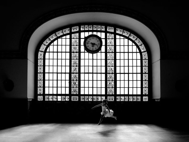
I like that example because we always talk about contrast (between the figure background relationship) makes photo more better but at this two examples at the left photo man complete the black triangle isnt it?
Also some photos was shown to disscuss more and the difference between graphic and minimal photos.
How can we ‘minimize’ an issue